Redesign
This past week, I’ve sat and read through most of the 14 posts I’ve written since I started this blog, and in doing so realised something fairly crucial. It is not easy to read. Time for a redesign (already)!
In fairness, this blog started its life as an addition to my main portfolio site for no other reason than I wanted an outlet to write. I had no intention (and still don’t, in all honesty) of developing a growing readership; this blog is very much still just for me. But, on the off-chance that someone stumbles across it, it should at least be readable (if not always coherent).
In addition, the original blog was designed to mimic the style of my main site as much as possible; it’s probably a good idea for me to decouple the two (even though they’re hosted on the same domain), as my blog is more focused on personal writings compared with the professional tone of my main site.
So, the major changes are as follows:
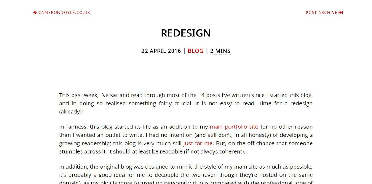
- All-white background across all sections (no more two-tone blue and grey).
- Red complementary colour on all links to make them more prominent and to detract from the monotony of a fully achromatic design.
- Removed all non-content images (primarily header images) to give more focus to the content and decrease page-weight (the average page is now under 500KB - I’m aiming to decrease this even further in the coming weeks).
- Reduced the size of the footer to only social icons (no email address), and without non-content images, I no longer need a link to my photographer’s website (this is still linked from my main page where I use her images).
- Changed the favicon from blue to red to match the new colour scheme.
Overall, I’m very pleased with the cleaner style. No doubt there’ll be errors here and there (if you find any, please tell me), and I’ll tweak the design over the coming months, but on the whole I do enjoy the new design. As I did in my very first post, here’s a screenshot for future reference of what the new design looks like.

As I’m never really satisfied, this will probably be the first of many overhauls to the blog design. I consider this one of the perks of writing my own code; for now though, I really like how it looks. I might even spread the design across to my main page…
Recent "blog" posts
| Priorities | 10 Sep 2017 |
| Tag Cloud | 15 Dec 2016 |
| Audience | 18 Dec 2015 |